Seven pieces from GIS coursework at the University of San Francisco. Graded class exercises and one self-directed final project, not research. The questions were mostly set by the assignment rather than by me. The Alameda County project is the exception, which was mine.
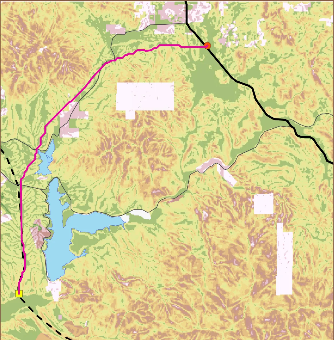
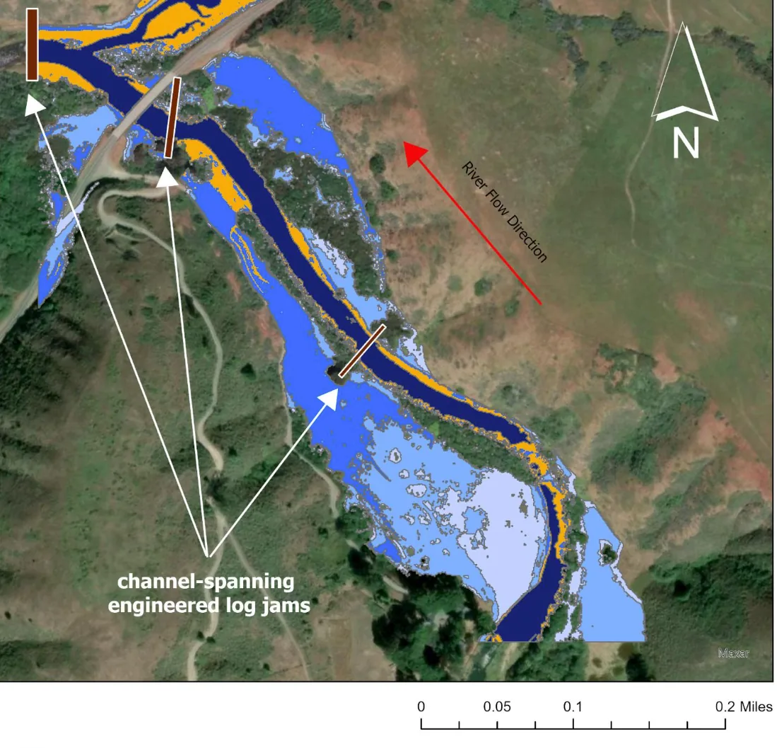
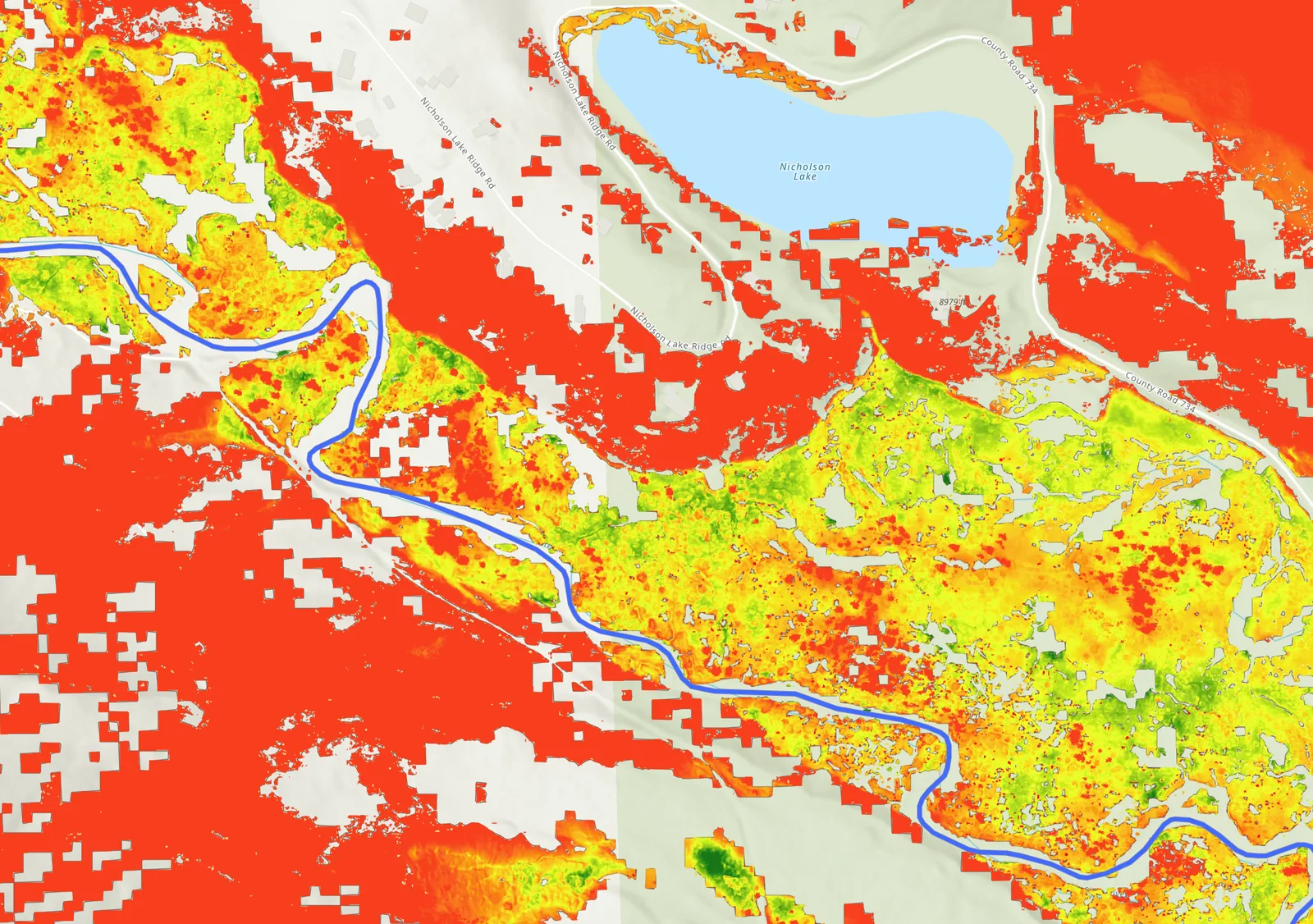
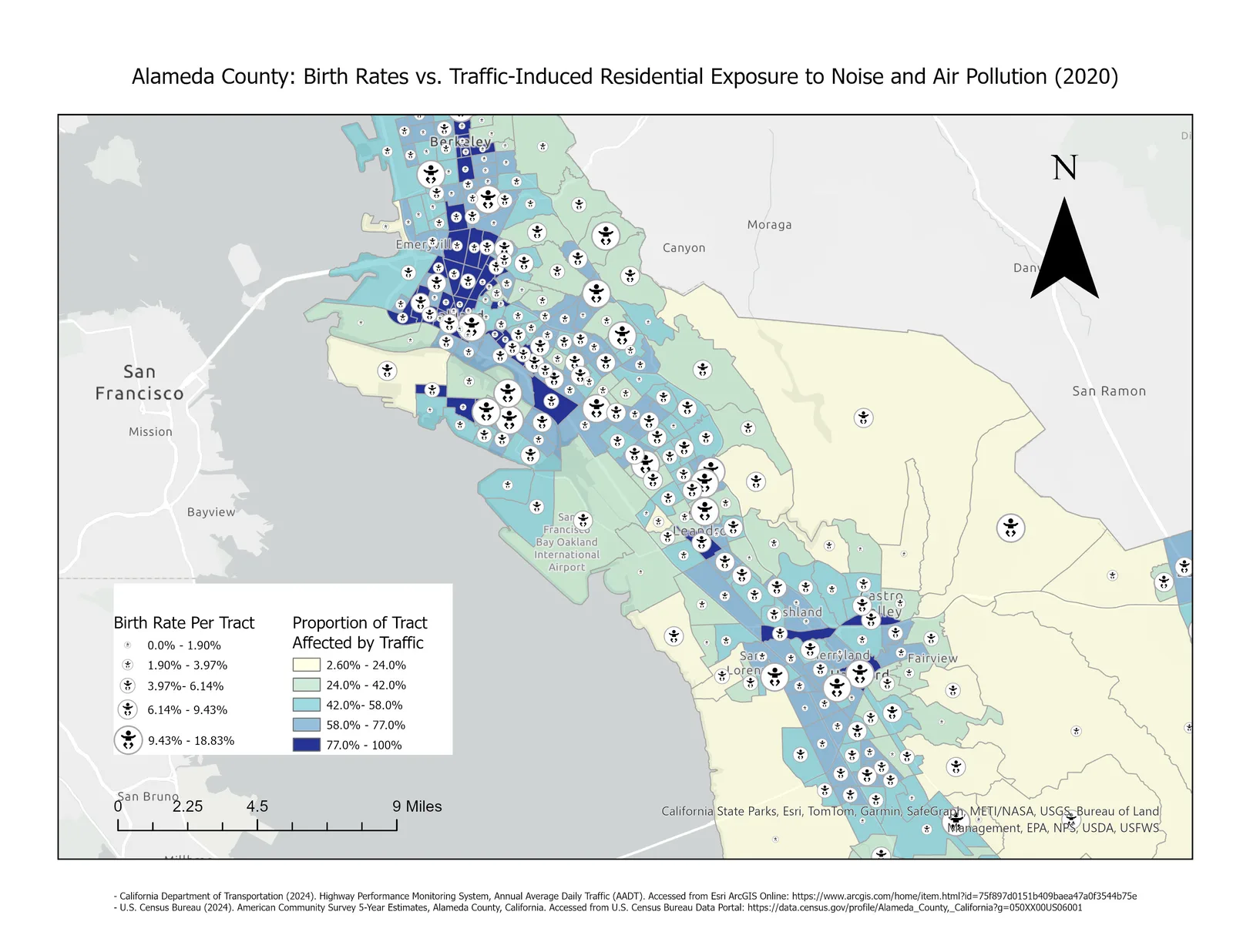
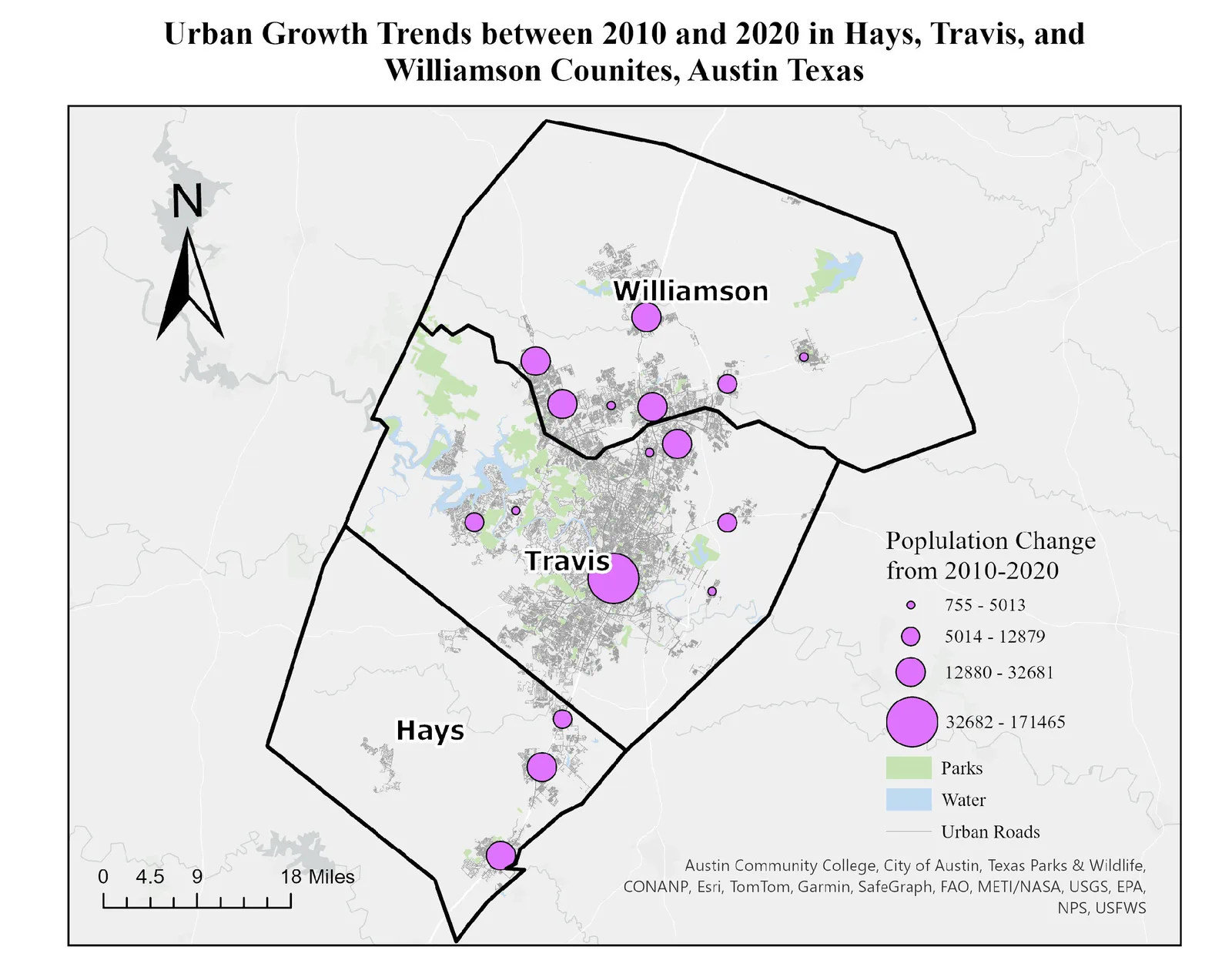
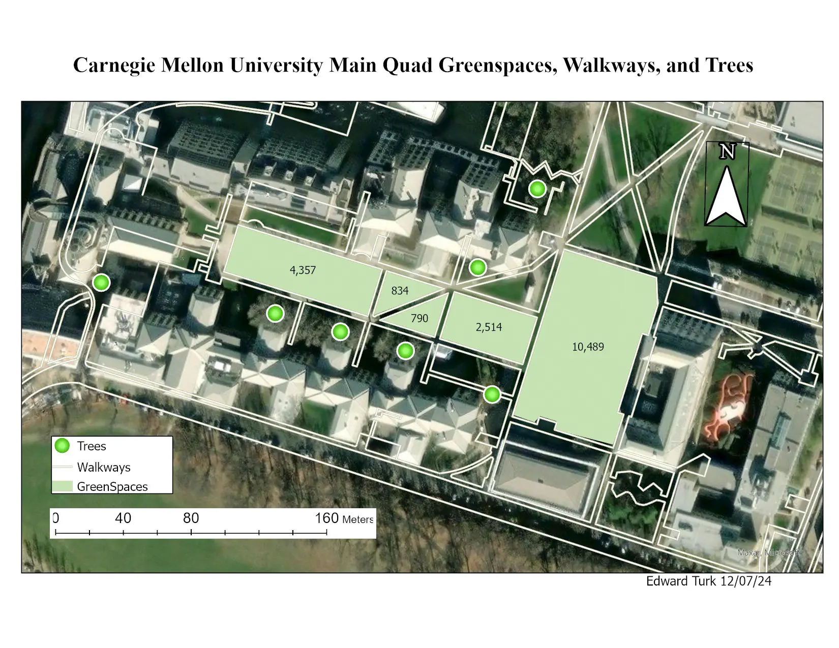
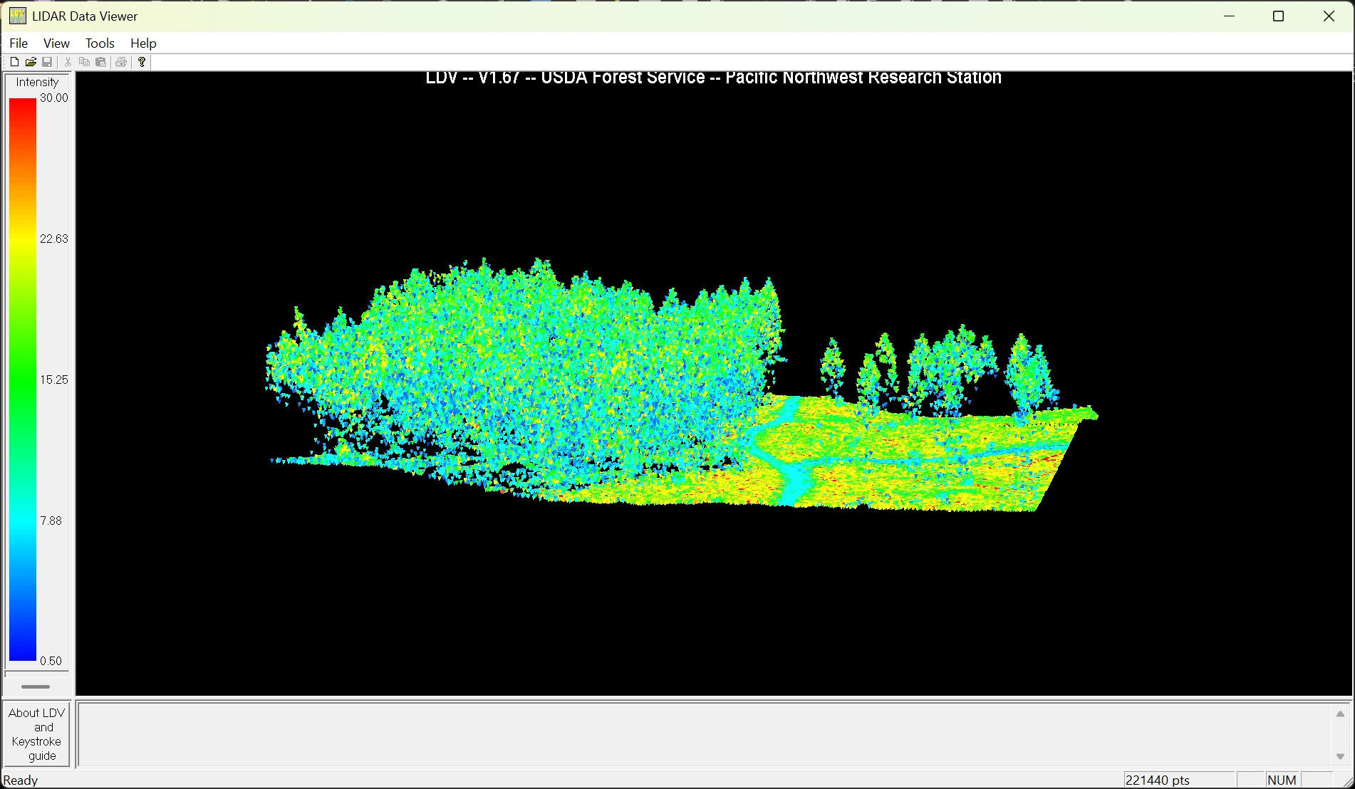
Routing a transmission line by least costClass assignment · ArcGIS Online Map Viewer · Published November 2025Two fixed points, a valley between them, and terrain left to argue for the route. I turned slope into a cost surface, binning 0 to about 30 degrees into ten steps priced 1 through 10, and let the least-cost path fall out of that. The route came out just under 19 km. The reclass table is published alongside the map, all ten rows of it, so anyone can check the bin edges instead of taking my word for the cost surface. The underlying data is instructional and modified, so this is a class exercise, not a siting study for anyone.Mapping re-connectable floodplain habitat in Walker CreekClass assignment · Introduction to LiDAR · FUSION, LAStools and ArcGIS ProLower Walker Creek runs into Tomales Bay and carries coho salmon, and restoration there means giving the creek its floodplain back. I built a 1 m bare-earth DEM from 2018 USGS 3DEP LiDAR and measured how much ground reconnects at each meter the water comes up. Widening the stream by anything meaningful for salmon takes at least two meters of rise. Doing it by excavation instead would mean roughly 44,230 cubic yards of material, about 550 backyard pools. The risk is that a two-meter design head can become a four-meter rise in a storm and put the nearby road under water.Modeling methane potential in an alpine floodplainClass assignment · Fuzzy overlay in ArcGIS · Published December 2025Methane leaves wetland soils unevenly, and a lot of what drives that is too small for a satellite to find. For a floodplain in the Slate River watershed I scored five environmental drivers as fuzzy surfaces and multiplied them together, so any single missing requirement takes a pixel to zero rather than getting averaged away. The drivers came from what is known to control methanogenesis, not from fitting anything to observations. It maps where the conditions line up, and a limiting-factor pass shows which of the five is holding each place back. Nothing in it has been checked against measured flux.Traffic exposure and birth rates in Alameda CountySelf-directed final project · Introduction to GIS · ArcGIS ProAlameda County, 2020. The tracts with the highest share of residents near heavy traffic are also, in places, the tracts with the highest birth rates. That overlap sits along the bayside urban corridor rather than in the inland east county.Building a study area out of three countiesClass assignment · Introduction to GIS · ArcGIS ProPopulation change 2010–2020 across the Austin metro study area. Austin itself dominates the symbol scale, but the cluster of mid-sized circles strung north through Travis and Williamson counties is the suburban growth the study area was built to show.Digitizing green space for a stormwater projectClass assignment · Introduction to GIS · ArcGIS ProGreen space, walkways and trees digitized from imagery for a campus stormwater runoff project, with each green-space polygon labeled by calculated area. Drawn December 2024.Reading a forest in a LiDAR point cloudClass exercise · Introduction to LiDAR · FUSION / LDV221,440 LiDAR returns colored by intensity in FUSION's data viewer. Canopy and open ground separate out on return intensity alone, before any point classification is applied.