Master's research · Thesis in progress
Mapping soil moisture from vegetation phenology
Can satellite-observed vegetation predict soil moisture across an entire watershed?
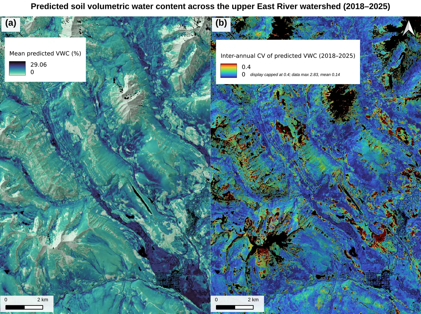
My master's research predicts soil moisture from space. The output is a continuous 10 m map of the upper East River valley near Crested Butte, Colorado, one surface per year from 2018 to 2025. I built it for terrain that is difficult, and in places impossible, to instrument directly.
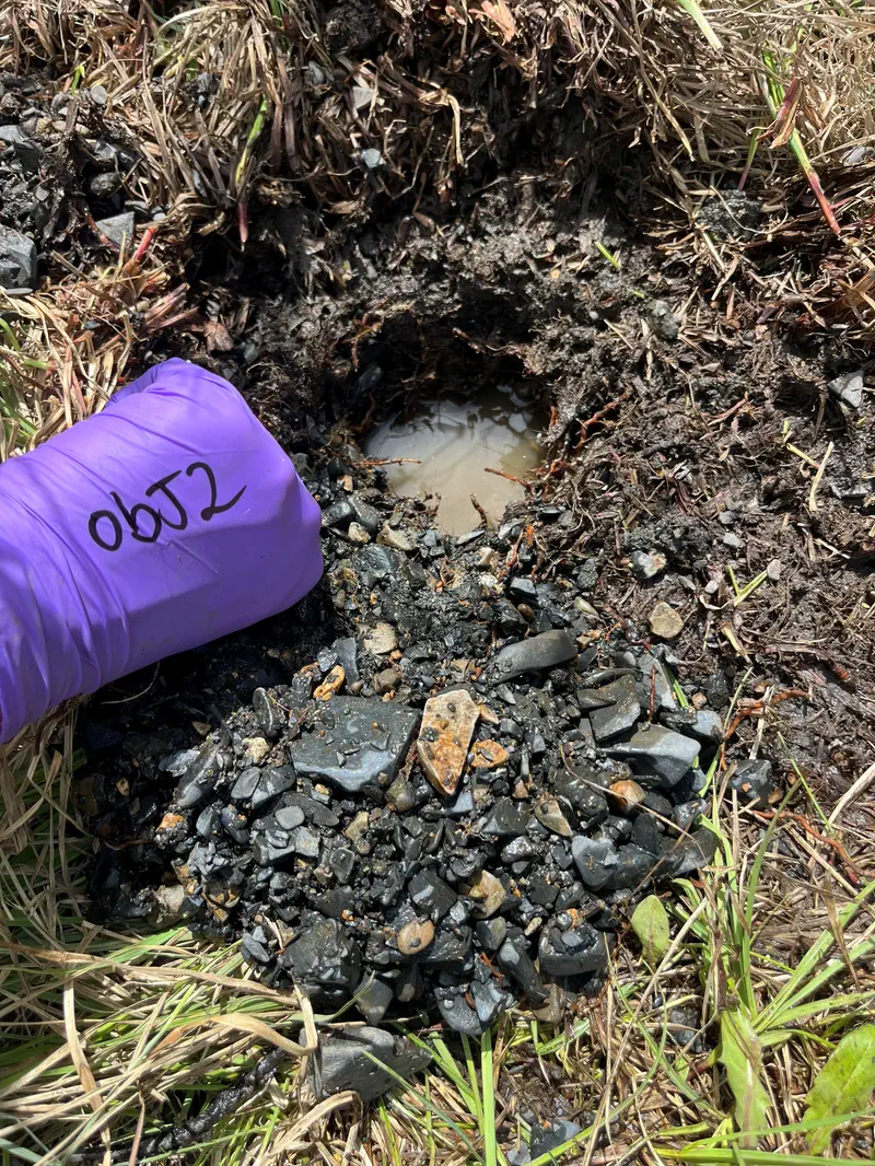
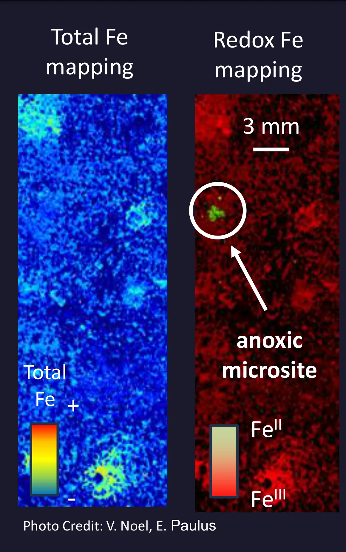
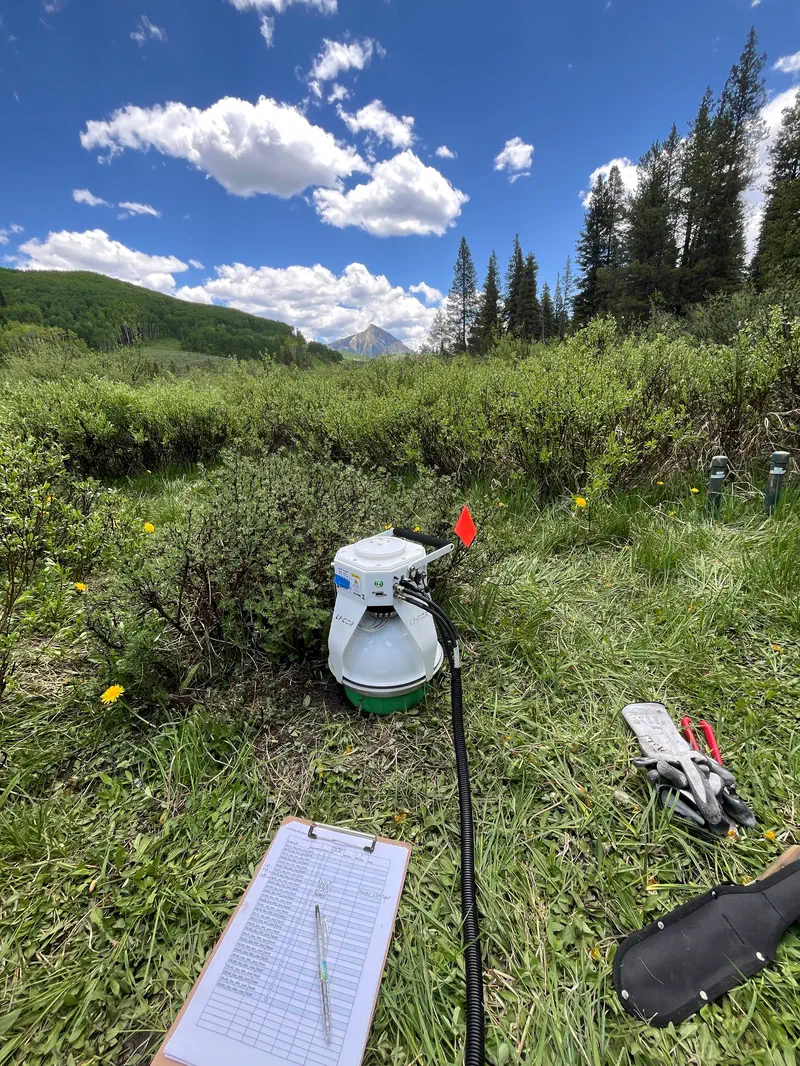
The question came from the field, and it started with methane. On the Slate River floodplain we ran collaborative flux campaigns in 2024 and 2025 with groups from Stanford and Cal State East Bay, taking roughly sixty chamber measurements across five sites laid out along a distance-from-river transect. The pattern was clear: methane flux rose with soil moisture, and the wettest sites were the active ones. That's a satisfying result over a thousand square metres of floodplain. It's also a trap. The processes that produce methane happen in anoxic microsites millimetres across. Moisture gradients running for kilometres switch those microsites on and off. You can't put a chamber on every hillside of a 6,000 km² watershed.
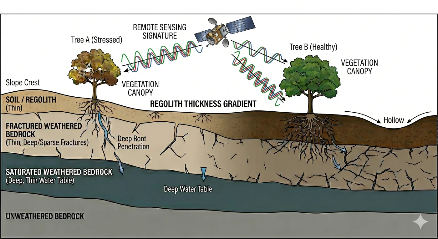
So I stopped asking about methane and asked a mapping question instead. If you can't measure the subsurface everywhere, can you infer it? The whole project rests on vegetation as a sensor: roots connect subsurface moisture to the canopy, plants integrate the water available to them over a whole season, and a satellite can watch that integration happen. Greenness is not moisture. But the timing and shape of a season of greenness carries information about the moisture underneath it, and unlike a soil probe, a satellite covers every pixel of the valley, every year, for free.
How it works
I turn ten years of satellite imagery into a small set of vegetation-timing measurements, then relate those to field soil-moisture readings with a model built to be tested on sites it has never seen. That last clause is the design constraint that shaped everything else: a map is only worth making if the model behind it works somewhere nobody sampled.
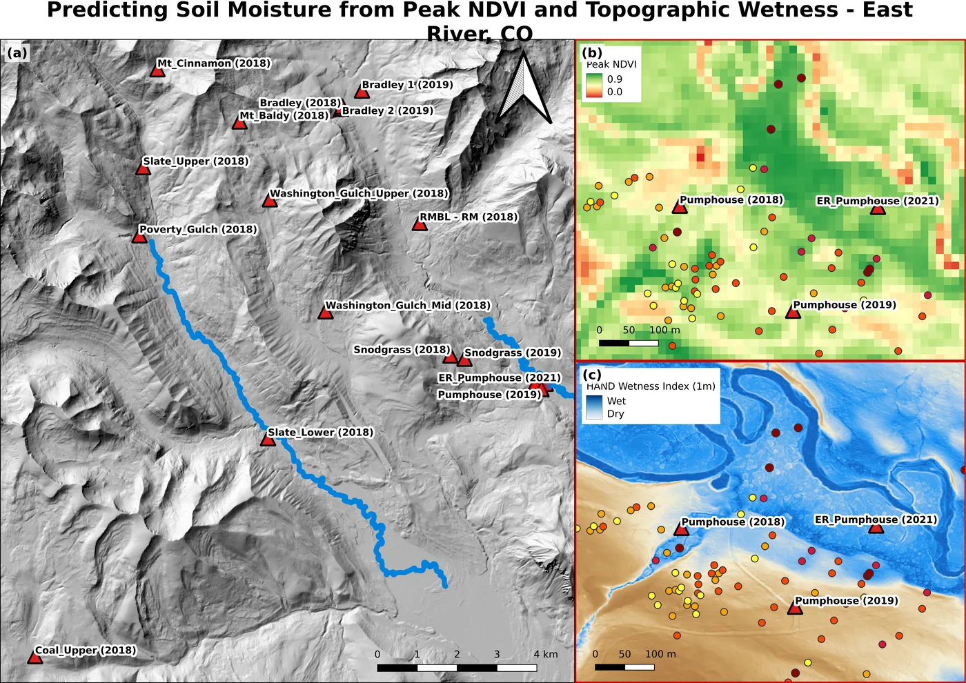
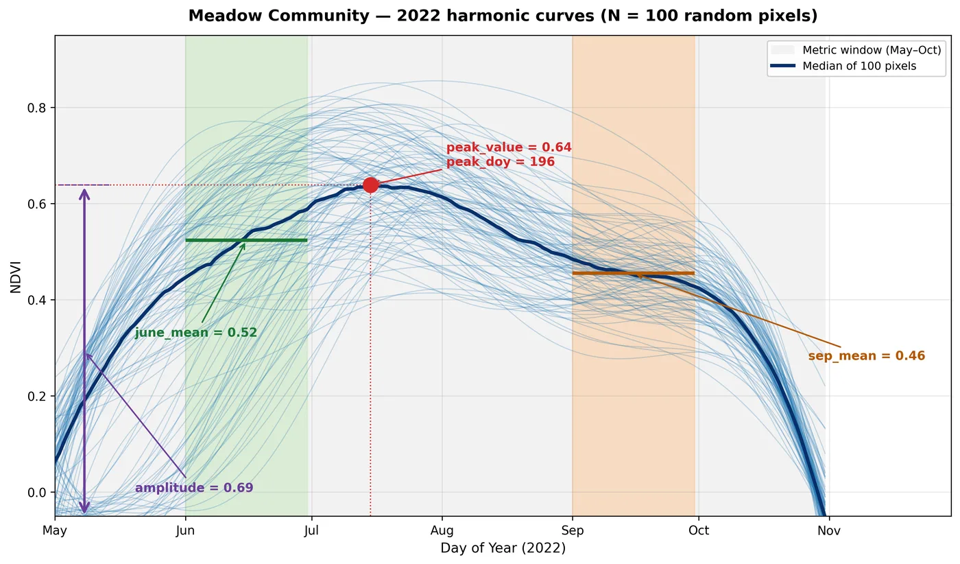
A word on each half. On the satellite side I fit a third-order Fourier harmonic regression to every pixel's NDVI record, one fit per year, which turns a ragged, cloud-gapped series of scene-dates into a smooth seasonal curve you can actually measure. From that curve come the phenology metrics: how green a pixel was in June, how green it got at its peak, how green it stayed in September, and how far it swung between them. The field half is 437 soil-moisture observations across 17 sites. The topographic baseline the vegetation signal has to beat is HAND (height above nearest drainage), computed from a LiDAR DEM. That's the standard physically-grounded answer to "where does water collect?"
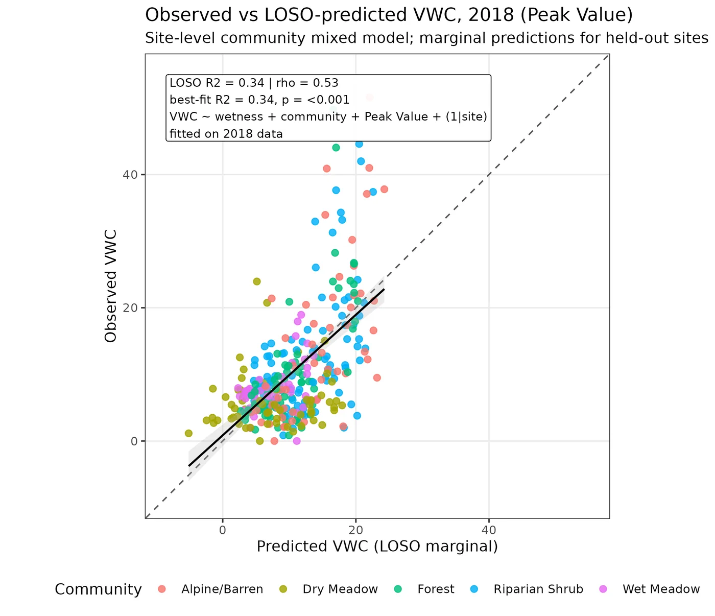
The two halves meet in a pooled linear mixed-effects model with a random intercept per site, fit in R with lme4. I validate it leave-one-site-out: hold a whole site back, fit on the rest, predict the held-out site from the fixed effects only. No site intercept, because a new location on a map doesn't come with one. That's a deliberately unflattering test, and it's the only one that resembles what the model has to do once I deploy it as a raster.
- ~419 Sentinel-2 scene-dates (2016–2025)
- per-pixel 3rd-order Fourier harmonic regression
- phenology metrics: June mean, Peak NDVI, Sep mean, seasonal amplitude
- 437 soil-moisture observations · 17 sites
- pooled linear mixed-effects model (site random intercepts)
- leave-one-site-out validation
- annual 10 m VWC maps
Model specification and supporting analyses
Specification. The deployed model is
VWC ~ wetness index + vegetation community + Peak NDVI + (1 | site), fit with lme4 in R.
Vegetation community enters as a between-site fixed effect: sites in different plant communities sit
at different moisture levels, and telling the model which community a location belongs to keeps that
offset off the spectral term.
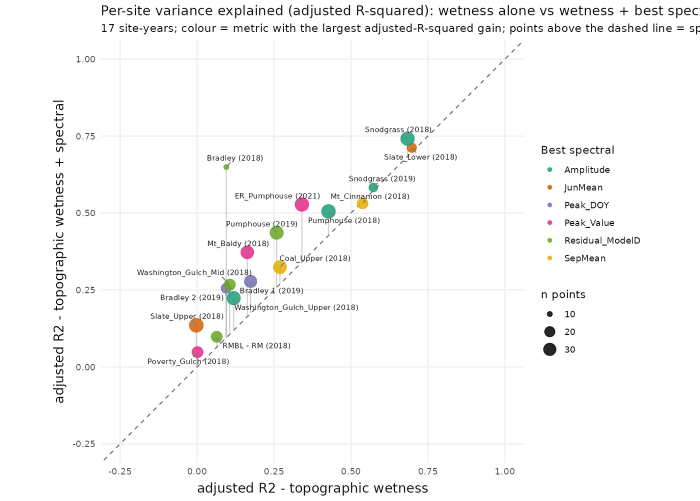
Metric selection. I entered candidate spectral predictors one at a time and scored them under leave-one-site-out cross-validation rather than by in-sample fit. Peak NDVI won on every out-of-site measure.
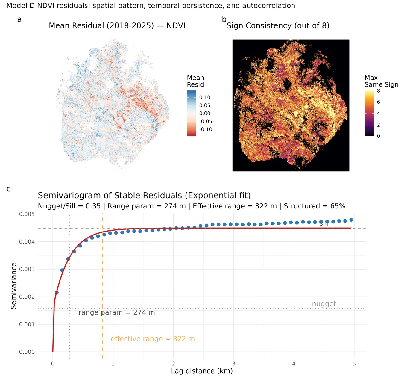
The PCMA residual. The pipeline also produces a phenology-conditioned moisture anomaly (PCMA): a per-year regression of late-season NDVI on early-season phenology and vegetation class, whose per-pixel residual I read as a moisture anomaly. It's a genuinely useful diagnostic product. The residual field is spatially coherent (variogram range ~274 m, roughly 65% of its variance spatially structured) and stable year to year. But in the head-to-head it lost. Peak NDVI out-predicted the PCMA residual at held-out sites on every metric, and adding the residual on top of Peak NDVI bought nothing. The simpler metric carries the transferable signal. I'm reporting that as a result, not hiding it as a failure.
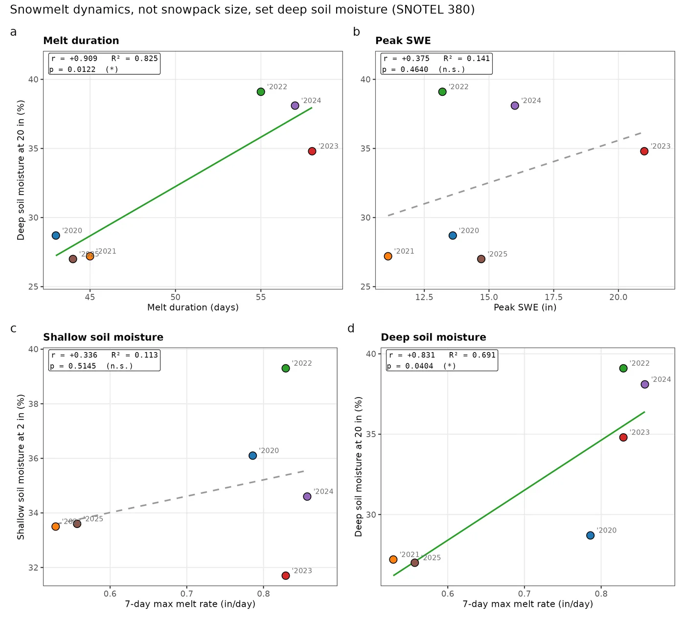
The snowmelt bridge. A separate analysis at SNOTEL station 380 supplies the mechanistic why. Deep soil moisture (20 in) tracks snowmelt duration (r = +0.909, p = 0.012) and 7-day maximum melt rate (r = +0.831, p = 0.040), but not peak snow-water equivalent. Melt dynamics recharge the deep soil, not snowpack size, and deep moisture is what feeds the early-season productivity the phenology metrics later detect. Six water years. Exploratory, and labelled that way in the manuscript.
Full pipeline, notebooks and figure crosswalk: see the repository.
What it found
- 18% skill lost when predicting at a site the model has never seen
- 10 m resolution, one map per year, 2018–2025
- 437 field soil-moisture observations across 17 sites
-
Transferability is the story
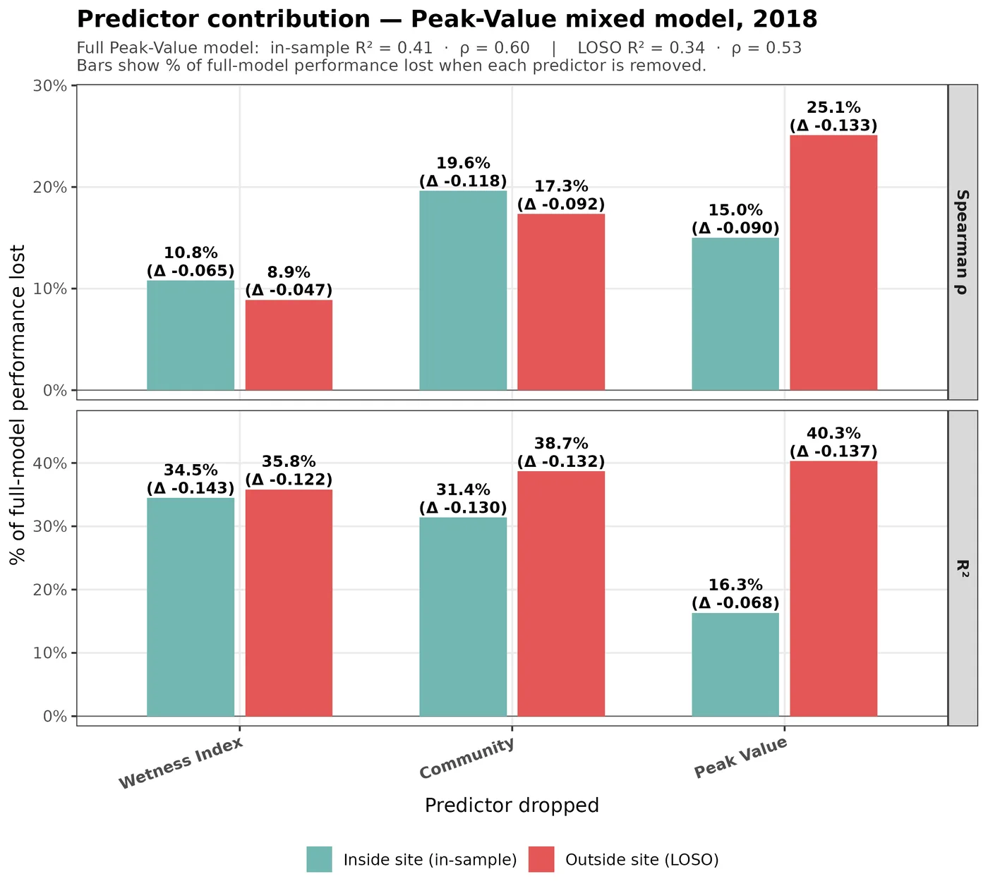
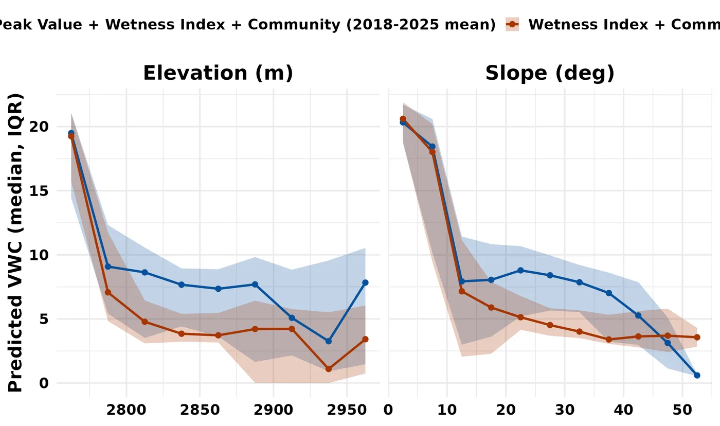
Peak NDVI is the strongest predictor at new sites even though it's the weakest predictor within any single site. Drop it from the model and in-sample fit barely notices, because it's the smallest of the three contributors. Drop it and ask the model to predict a site it was never fit on, and it becomes the largest. The metric that looks least useful when you check your work is the one that makes the map work. In-sample importance is a misleading guide to what a predictor is worth in deployment, and that generalises well beyond this watershed.
-
The numbers behind that
The full model reaches an in-sample R² of 0.415. Under leave-one-site-out validation it holds at 0.340, an 18% relative loss, with a Spearman ρ of 0.528 and an RMSE of about 7% VWC. Losing under a fifth of your skill when the location changes is what makes a raster defensible rather than decorative.
In the maps
The argument runs as a sequence of figures: where the data came from, why vegetation should carry a moisture signal at all, what the satellite actually measures, where the spectral term helps, whether it survives being tested on unseen sites, and what falls out the far end.
A companion strand: imaging the microsites directly
Running alongside the mapping work is a strand that attacks the same question from the opposite end of the scale. Using synchrotron µ-X-ray fluorescence at Stanford's SLAC, we imaged Fe(II)/Fe(III) redox chemistry inside intact soil cores (the millimetre-scale anoxic microsites themselves) and correlated that chemistry with lab methane-flux incubations on the same material.
This is scientific context for why moisture is the variable worth mapping. It is not validation of the maps and it is not the deliverable. It's here because it's the other half of how I think about the problem: I've collected the field and lab data that GIS layers are made of (flux chambers, soil cores, porewater chemistry), not just downloaded them.
Honest limits & status
Honest limits
- A first-author manuscript is in preparation: not submitted, not under review, not published. It is intended for MDPI Remote Sensing.
- Prediction skill degrades above roughly 24% volumetric water content: the wettest ground is systematically under-predicted, a ceiling a linear model cannot clear with these predictors.
- Calibrated on one watershed. Leave-one-site-out is cross-validation inside a single sampling network, not independent regional validation. Transfer beyond this basin is untested.
Outputs
- Repository MastersThesis on GitHub
- Poster AGU 2025, first author (PDF)
- Poster CARD 2026 thesis poster (PDF)
- Manuscript One first-author manuscript, in preparation (PDF)
- Data products Annual 10 m predicted VWC rasters, 2018–2025, plus inter-annual variability surfaces
Interested in this work?
I'm an early-career environmental data scientist in the SF Bay Area.