Class assignment · Introduction to GIS · ArcGIS Pro
Building a study area out of three counties
Before you can analyze anything you need a study area, and nobody hands you one.
What it was
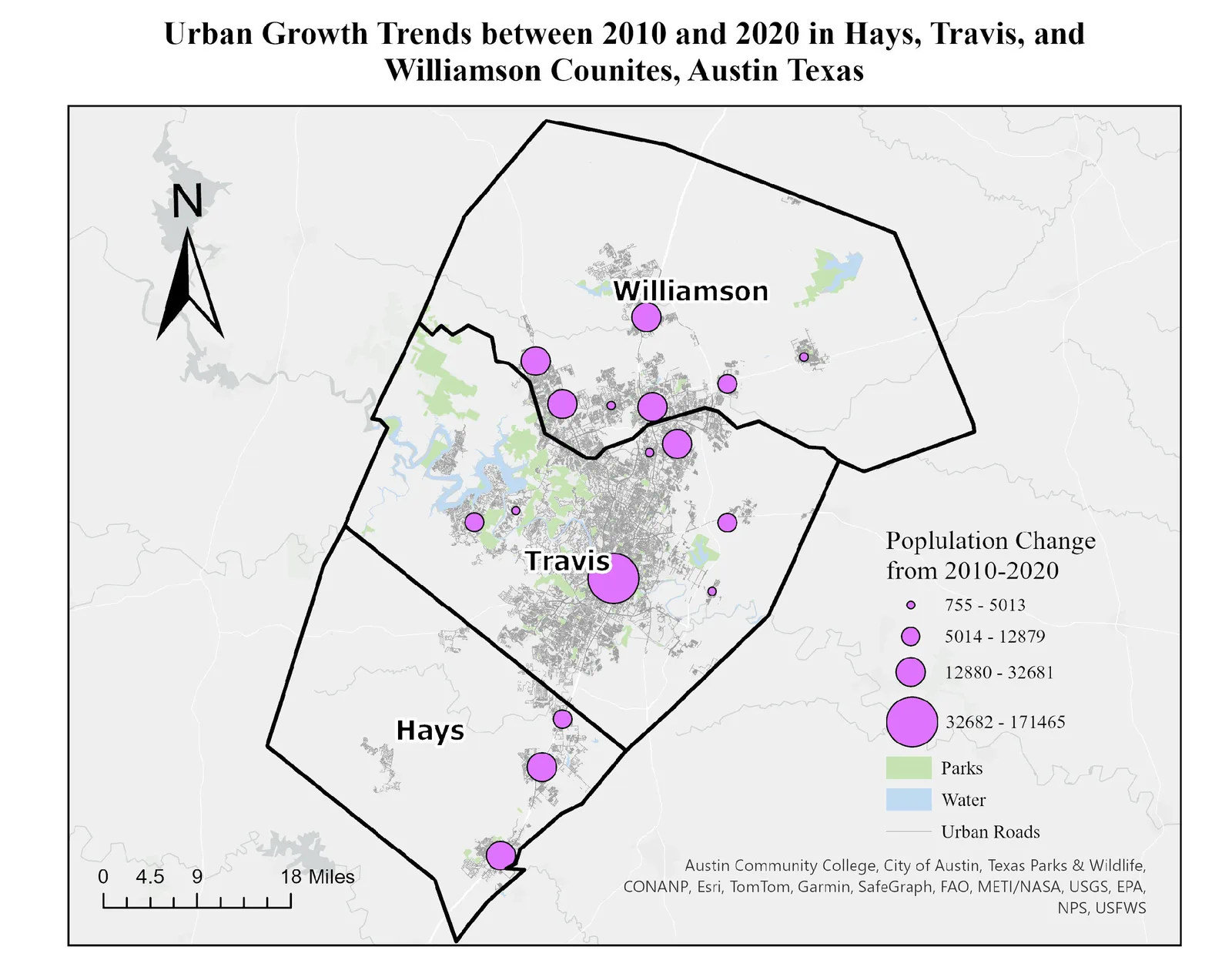
The assignment was to assemble an Austin-metro study area from raw county data and then show population change across it. Hays, Travis and Williamson counties, each arriving from the Census Bureau as its own separate set of layers: cities, roads, parks, water, urban areas. Nothing in that stack knows about the other two counties.
How it worked
Straight geoprocessing in ArcGIS Pro. I merged the matching layers across the three counties, clipped everything to the study-area boundary, and dissolved where the county lines left seams that meant nothing on the ground. Then I symbolized 2010–2020 population change over the finished base, as graduated circles scaled to the change in each city.
What I learned
Most of the time went to the unglamorous part. Getting three counties' worth of features onto one map without duplicate geometry or mismatched attributes is the whole job, and it happens before any of the visible work starts. A merge that leaves two versions of the same road looks fine until something downstream counts it twice.
Figure