Environmental Data Scientist · GIS · Remote Sensing · Water Resources · SF Bay Area

I map what's happening below the surface using what satellites see above it.

I'm Edward Turk, an environmental data scientist in the San Francisco Bay Area. I've done the field and lab work, and I work with satellite imagery, spatial models, and interactive tools, mostly on systems that are hard to measure directly.

Concept diagram: plant roots connect subsurface soil moisture to the canopy, so satellite-observed greenness carries information about the moisture below.
Concept diagram from my master's research on soil-moisture mapping.

The through-line

Making the unseen legible

Plenty of what matters can't be watched directly: moisture under a hillside, a farming practice spread across a whole valley, the inner workings of a team of AI agents. My work is mostly the same move in different domains. Find a signal you can see, use it to infer the thing you can't, and be honest about the uncertainty in between.

  1. Observe canopy greenness, field moisture, topography, agent tool calls
  2. Model spatial analysis, statistics, or software turn the signal into a testable form
  3. Validate where it transfers, where it fails, how the uncertainty is shown
  4. Make visible maps, figures, and interfaces someone else can inspect

Selected work

Three projects, one method

Master's research · Remote sensing · Water resources

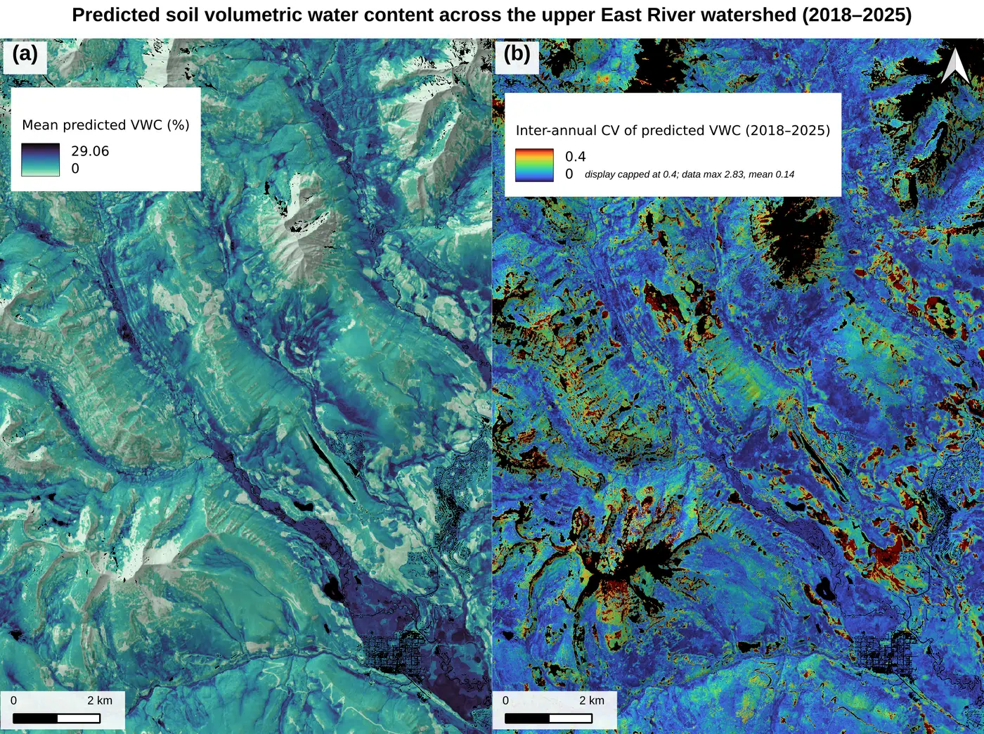
Mapping soil moisture from vegetation phenology

Testing whether Sentinel-2 vegetation time series can predict watershed-scale soil moisture in the Upper Gunnison / East River watershed near Crested Butte, Colorado.

10 m maps · 437 ground measurements, 17 sites · leave-one-site-out validation

AGU 2025 · manuscript in preparation

Experiment · Work in progress · Agriculture

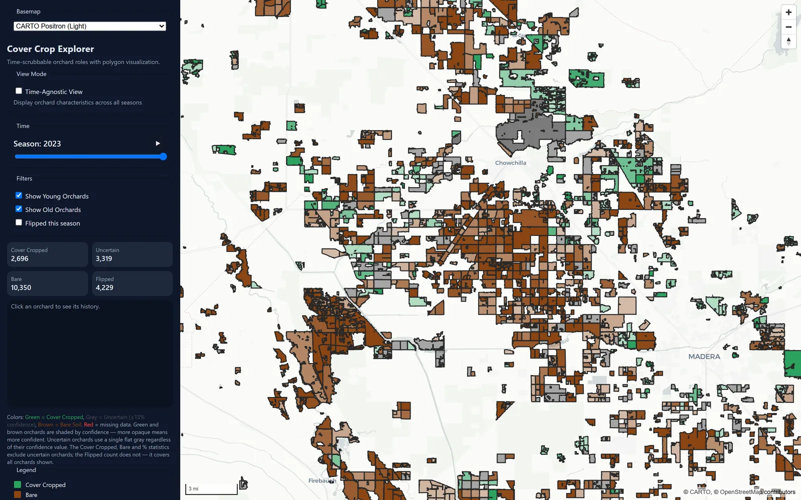
Cover Crop Explorer

An interactive, serverless map that estimates winter cover-crop signals across California almond orchards using free satellite imagery. Counting that on the ground means a census, so this asks how much you can infer from space instead.

16,365 orchards · 9 counties · 6 winters (2018–19 … 2023–24)

Experiment · Work in progress

Software project · Electron · React · TypeScript

Lares Agent IDE

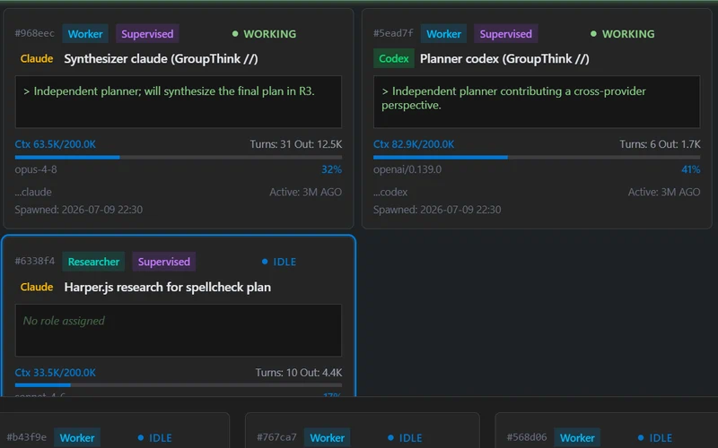
A visibility-first desktop workspace for watching, directing, and collaborating with teams of AI agents across terminals, files, browsers, documents, and notebooks.

Harness-based, not SDK-based · cross-provider GroupThink · governed browser

Short demo forthcoming

Coursework

Class exercises

A few pieces from GIS coursework at the University of San Francisco. Graded class exercises and one self-directed final project, not research. They're here because they cover ground the three projects above don't: routing a power line across a cost surface, building a bare-earth terrain model from airborne LiDAR, and scoring a floodplain against five environmental drivers at once. And three more: hand-digitizing from imagery, building a study area out of county data, and reading a raw LiDAR point cloud.

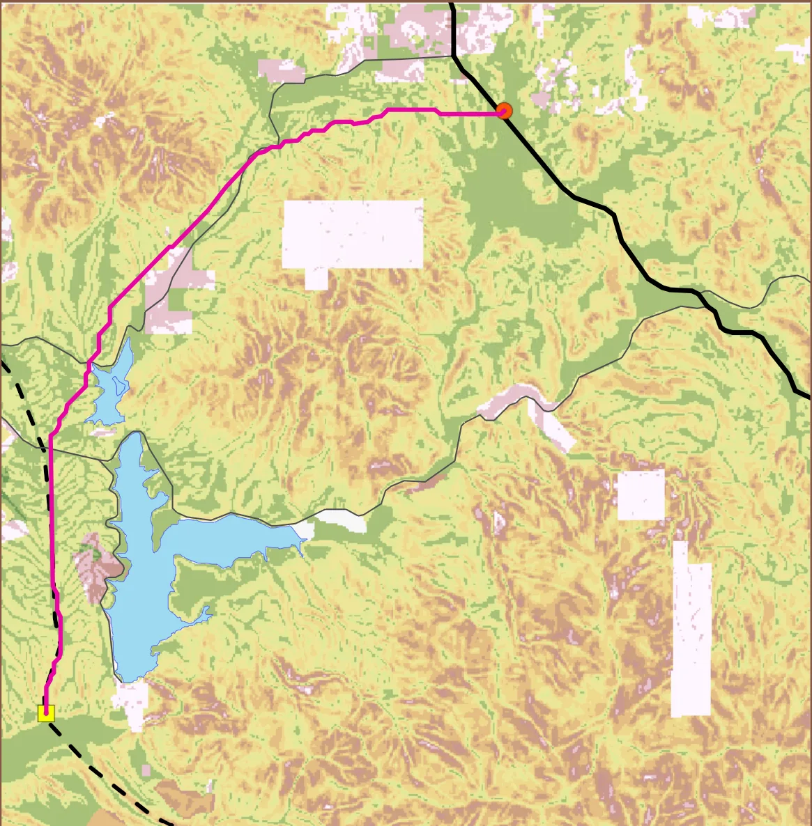
Topographic map of hilly terrain shaded in greens, tans and olive. A magenta line runs from a small yellow square marker at the bottom left, north along the western side of the frame past a blue reservoir, then bends east across the top to an orange circular marker. A heavy black line continues southeast from that orange marker toward the lower right. A dashed black line runs close to the magenta line near the bottom left. Thin grey roads and pale rectangular patches are scattered across the frame. No legend or scale bar is in view.
Routing a transmission line by least cost Class assignment · ArcGIS Online Map Viewer · Published November 2025 Two fixed points, a valley in between, and terrain left to argue for the route. I turned slope into a cost surface, binning 0 to about 30 degrees into ten steps priced 1 through 10, and let the least-cost path fall out of that. The route came out just under 19 km. The reclass table is published alongside the map, all ten rows of it, so anyone can check the bin edges instead of taking my word for the cost surface. The underlying data is instructional and modified, so this is a class exercise and not a siting study for anyone.
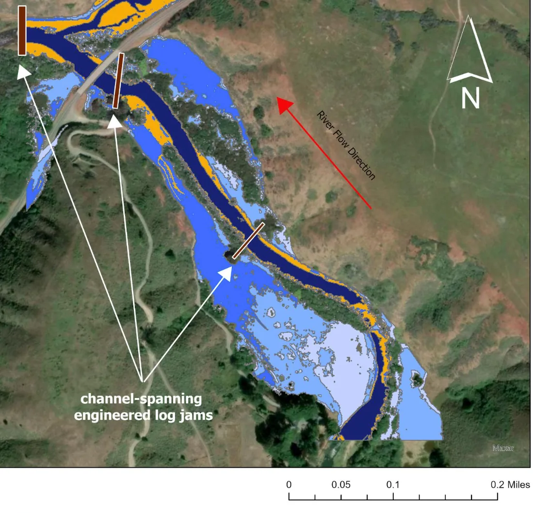
Satellite image of a creek winding through open grassland and scattered trees, with a road crossing the channel at the top left. Coloured bands are drawn over the valley floor: a dark navy core along the channel, then medium blue and pale blue spreading outward, with a thin orange fringe between them. Three short dark brown bars sit across the channel and are picked out by white arrows leading to the bold white label “channel-spanning engineered log jams”. A red arrow labelled “River Flow Direction” points up-valley, a north arrow sits at the top right, and a scale bar reading 0 to 0.2 miles runs along the bottom.
Mapping re-connectable floodplain habitat in Walker Creek Class assignment · Introduction to LiDAR · FUSION, LAStools and ArcGIS Pro Lower Walker Creek runs into Tomales Bay and carries coho salmon, and restoration there means giving the creek its floodplain back. I built a 1 m bare-earth DEM from 2018 USGS 3DEP LiDAR and measured how much ground reconnects at each meter the water comes up. Widening the stream by anything meaningful for salmon takes at least two meters of rise. Doing it by excavation instead would mean roughly 44,230 cubic yards of material, which is about 550 backyard pools. The catch is that a two-meter design head can become a four-meter rise in a storm and put the nearby road under water.
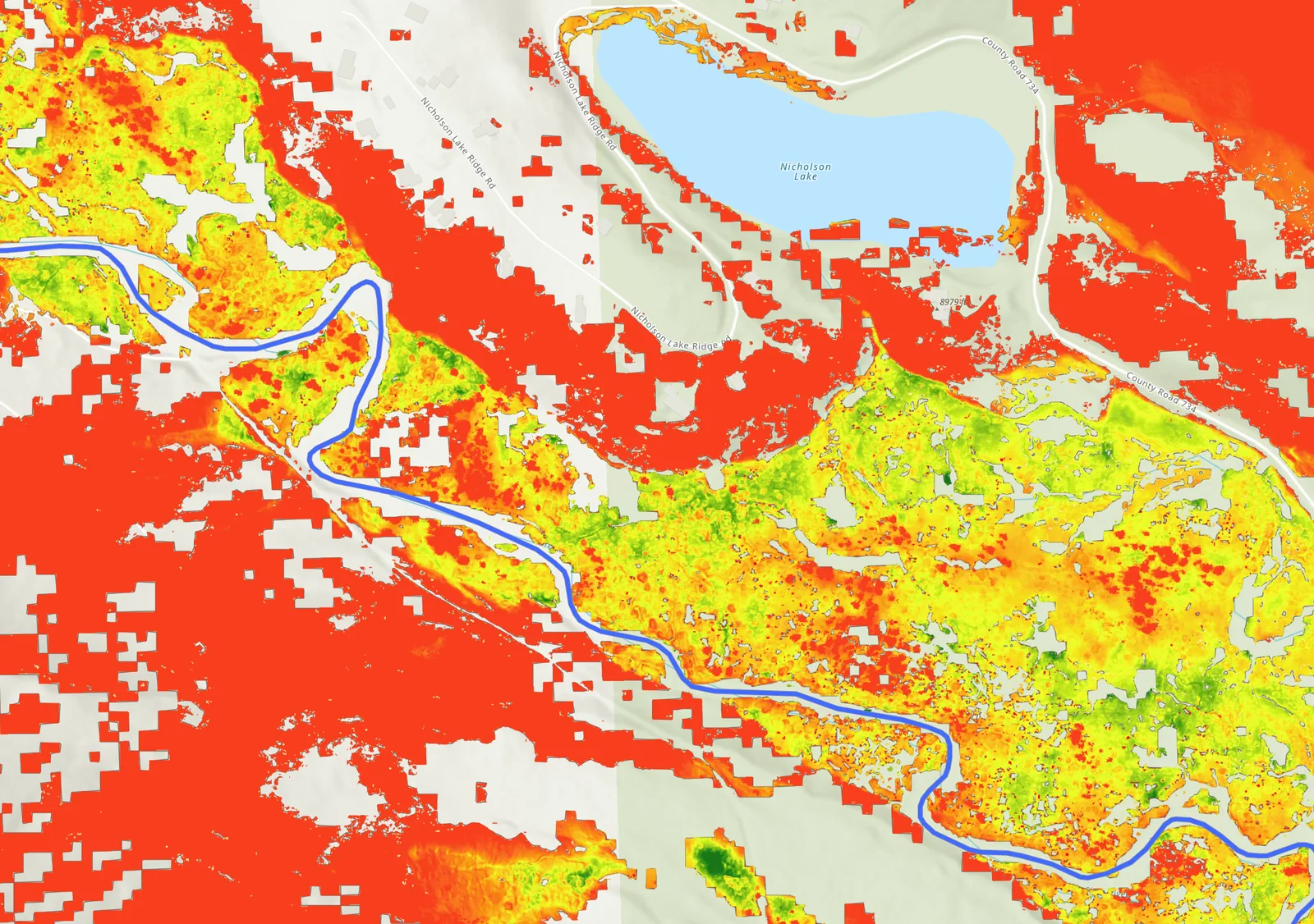
A continuous raster surface draped over a river valley, coloured on a ramp from red through orange and yellow to green. Green and yellow concentrate on the valley floor on both sides of a blue river line that meanders across the frame, while solid red covers the higher ground around it. Nicholson Lake is labelled in pale blue at the top, with Nicholson Lake Ridge Rd and County Road 734 running past it and a spot elevation reading 8979 ft beside it. Pale grey patches carry no raster values. No legend, scale bar or north arrow is in view.
Modeling methane potential in an alpine floodplain Class assignment · Fuzzy overlay in ArcGIS · Published December 2025 Methane leaves wetland soils unevenly, and a lot of what drives that is too small for a satellite to find. For a floodplain in the Slate River watershed I scored five environmental drivers as fuzzy surfaces and multiplied them together, so any single missing requirement takes a pixel to zero rather than getting averaged away. The drivers came from what is known to control methanogenesis rather than from fitting anything to observations. It maps where the conditions line up, and a limiting factor pass shows which of the five is holding each place back. Nothing in it has been checked against measured flux.
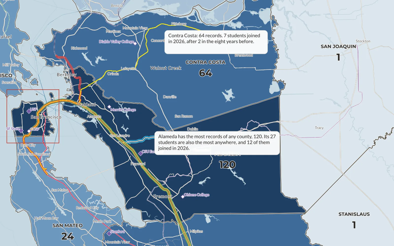
Map of Alameda County, California. Census tracts are shaded from pale yellow to dark blue for the proportion of the tract affected by traffic, and each tract carries a circular infant symbol scaled to its birth rate. The darkest, most heavily symbolized tracts run along the Oakland–San Leandro–Hayward corridor.
Traffic exposure and birth rates in Alameda County Self-directed final project · Introduction to GIS · ArcGIS Pro Alameda County, 2020. The tracts with the highest share of residents near heavy traffic are also, in places, the tracts with the highest birth rates. That overlap sits along the bayside urban corridor rather than in the inland east county.
Grey-and-white map of a three-county study area around Austin, Texas, labeled Hays, Travis and Williamson. Magenta circles of varying size mark cities, scaled to population change between 2010 and 2020; the largest circle sits over Austin in Travis County. Parks are green, water is blue, urban roads form a dense grey web through the centre.
Building a study area out of three counties Class assignment · Introduction to GIS · ArcGIS Pro Population change 2010–2020 across the Austin metro study area. Austin itself dominates the symbol scale, but the cluster of mid-sized circles strung north through Travis and Williamson counties is the suburban growth the study area was built to show.
Aerial imagery of the Carnegie Mellon University main quad with hand-digitized layers drawn over it: pale green polygons for lawns and green spaces, each labeled with its calculated area, thin white outlines for walkways, and bright green dots for individual trees. A legend, north arrow and metric scale bar sit at the lower left.
Digitizing green space for a stormwater project Class assignment · Introduction to GIS · ArcGIS Pro Green space, walkways and trees digitized from imagery for a campus stormwater runoff project, with each green-space polygon labeled by calculated area. Drawn December 2024.
Screenshot of the FUSION LIDAR Data Viewer showing a side-on view of an airborne LiDAR point cloud against a black background. A dense block of forest canopy on the left gives way to open, textured ground on the right with a handful of isolated conifer crowns rising from it. Points are colored by return intensity on a blue-to-red ramp, keyed to a legend on the left; the status bar reads 221,440 points.
Reading a forest in a LiDAR point cloud Class exercise · Introduction to LiDAR · FUSION / LDV 221,440 LiDAR returns colored by intensity in FUSION's data viewer. Canopy and open ground separate out on return intensity alone, before any point classification is applied.

These are coursework, so the questions were mostly set by the assignment rather than by me. The exception is the Alameda County project, which was mine.

About

Field and lab science, then remote sensing

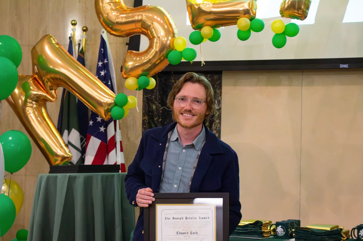
Edward Turk stands smiling behind a table, holding a framed certificate that reads The Joseph Petulla Award, Edward Turk. Large gold letter balloons and clusters of green and yellow balloons fill the background, with flags to one side and stacks of folded green graduation stoles on the table beside him.

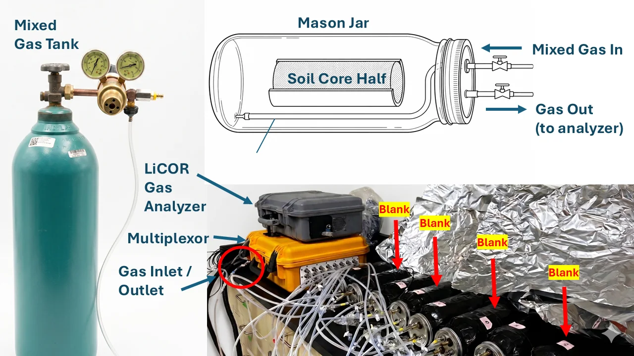
I spent roughly five years in laboratory and field science before remote sensing became most of my work. That background means I've collected the field and lab data that GIS layers are made of—methane flux chambers, groundwater wells, porewater chemistry, soil cores—not just downloaded it. Soil health and regenerative agriculture remain passions of mine.

I'm now a graduate research assistant at the University of San Francisco, working on floodplain hydrology. I use Sentinel-2 imagery, harmonic regression, and interactive tools to map environmental conditions that are hard to measure on the ground.

Earlier, I was a Research Associate II at Pivot Bio (2020–2023), on the team whose product was named to TIME's Best Inventions of 2023.

M.S. candidate, Environmental Management, University of San Francisco (2024–2026; degree confers on thesis completion) · Advanced Certificate in Geospatial Information Science · Joseph Petulla Award, Outstanding MSEM Graduate Student (2026) · B.S. Ecology & Evolution, UC Santa Cruz.

  • Spatial & remote sensing ArcGIS Pro, QGIS, Earth Engine, Sentinel-2, LiDAR
  • Analysis Python, R, SQL, mixed-effects models, harmonic regression, LOSO/LOVO validation, kriging
  • Environmental measurement soil sampling, groundwater, LI-COR trace-gas
  • Software & communication JavaScript, interactive mapping, technical figures, explainers
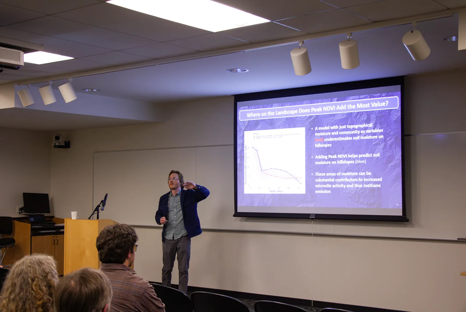
Edward Turk presenting his master's thesis. Thesis presentation (PDF)
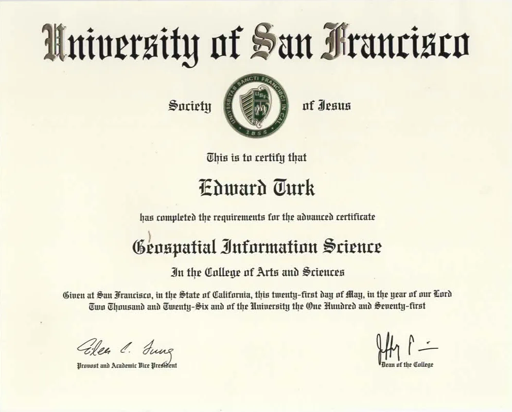
Certificate in blackletter type headed University of San Francisco, Society of Jesus, with the university seal. It certifies that Edward Turk has completed the requirements for the advanced certificate Geospatial Information Science in the College of Arts and Sciences, given at San Francisco on the twenty-first day of May, Two Thousand and Twenty-Six, and carries signatures from the Provost and Academic Vice President and the Dean of the College.
Advanced Certificate in Geospatial Information Science
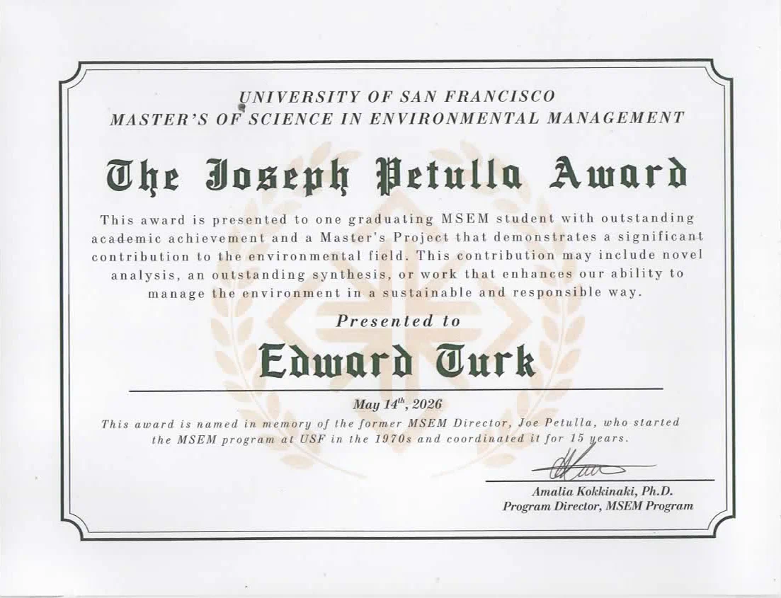
Certificate headed University of San Francisco, Master's of Science in Environmental Management, titled The Joseph Petulla Award in blackletter type over a faint laurel watermark. The text reads that the award is presented to one graduating MSEM student with outstanding academic achievement and a Master's Project that demonstrates a significant contribution to the environmental field. Presented to Edward Turk, May 14th, 2026, signed by Amalia Kokkinaki, Ph.D., Program Director, MSEM Program.
The Joseph Petulla Award
University of San Francisco