Experiment · Work in progress
Cover Crop Explorer
Instead of performing a census, can you do it from space?
This is an experiment and a work in progress. I was learning remote sensing and wanted something real to point it at. Agriculture and sustainability have interested me for a long time, I'd been wanting to build a web app, and the whole thing started in a class at an AGU conference on hosting exactly this kind of app.
Cover cropping matters for long-term soil health and nutrient management. Whether a given orchard planted one is normally something you find out by asking the grower or by driving out to look. So the question became: instead of surveying orchards on the ground, can you estimate which ones planted a winter cover crop from satellite imagery alone?
It's not my thesis. It's an applied remote-sensing experiment that turned into an interactive map.
How it works
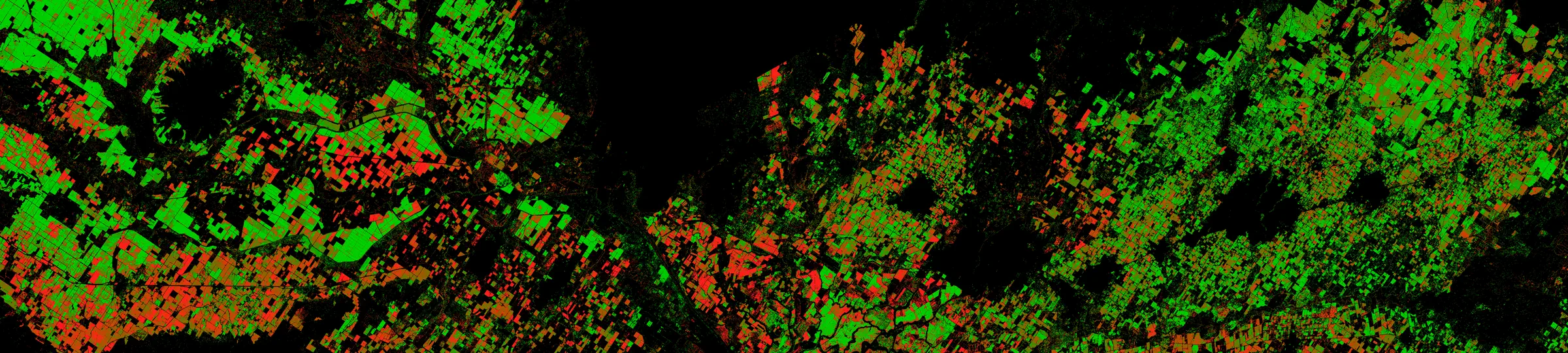
An almond orchard in winter is mostly bare trees over bare ground. Plant a cover crop and the green shows up between the tree rows, where Sentinel-2 can see it. I read each orchard's greenness and bare-soil signal across a winter and ask whether the inter-row space greened up in a way bare soil wouldn't.
The obvious failure mode is tree canopy. A mature orchard is greener than a young one no matter what's growing underneath, so a naive greenness threshold would quietly reward old orchards and punish new plantings. To get around that, I stratify orchards by tree age and judge each one against peers of its own canopy maturity rather than against the region as a whole.
- Sentinel-2 surface reflectance
- orchard-level greenness & bare-soil signals
- comparison within tree-age groups
- cover-crop classification + confidence
- static PMTiles web map
Stack and hosting
Everything runs client-side. Google Earth Engine and Python (scikit-learn, pandas) do the analysis offline. The app itself is fully static: PMTiles vector tiles, deck.gl rendering over MapLibre GL, Plotly for the per-orchard charts. No backend, no database, no API keys, nothing to keep running.
What it does
- 16,365 almond orchards classified
- 9 Central Valley counties
- 6 winters (2018–19 … 2023–24)
- 135 orchards show the cover-crop signal in all six winters
-
Tree-age stratification
I judge each orchard against peers of its own canopy maturity, so a full-canopy block doesn't fool a naive greenness read.
-
Confidence, scored and shown
Every call carries a confidence score. I render low-certainty orchards gray and keep them out of the headline counts, so a weak guess never passes for a firm one.
Read that first number carefully: 16,365 is how many orchards I classified, not how many were found to be cover-cropped. In any given winter, most of them are not.
In the app
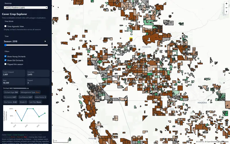
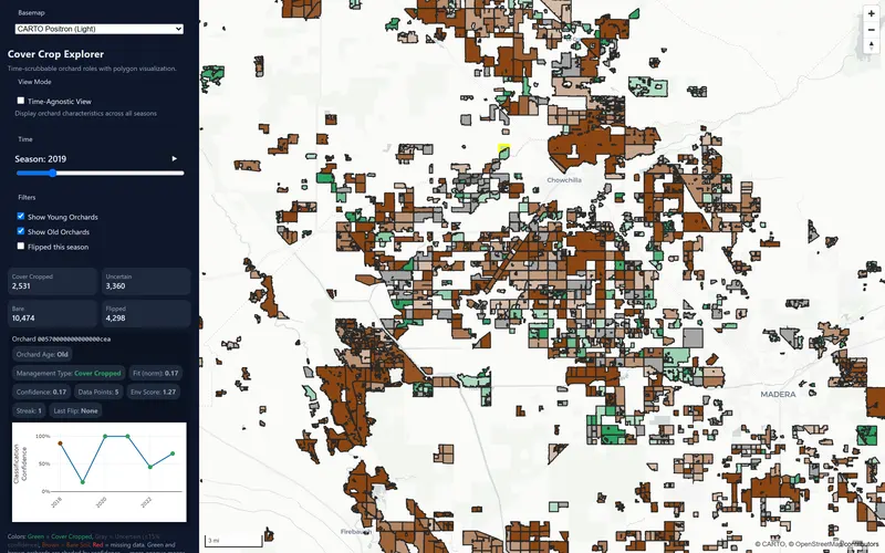
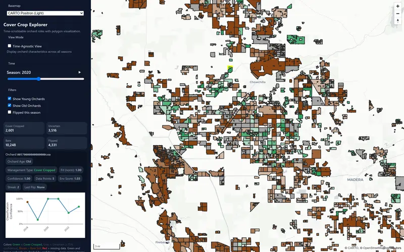
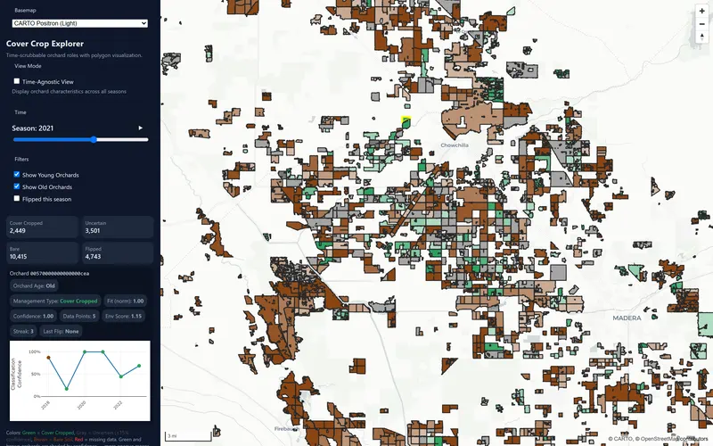
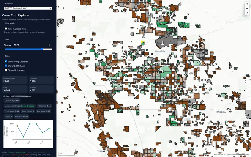
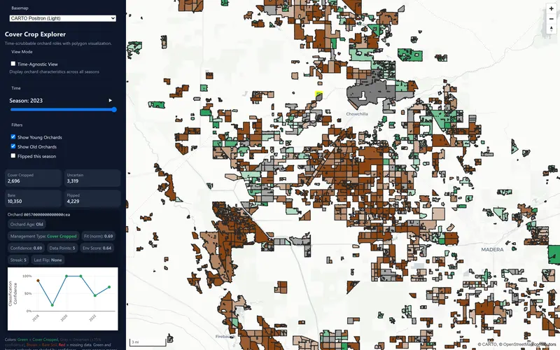
Four views, in the order you'd meet them: the extent, the detail, one orchard, and the same ground across six winters.
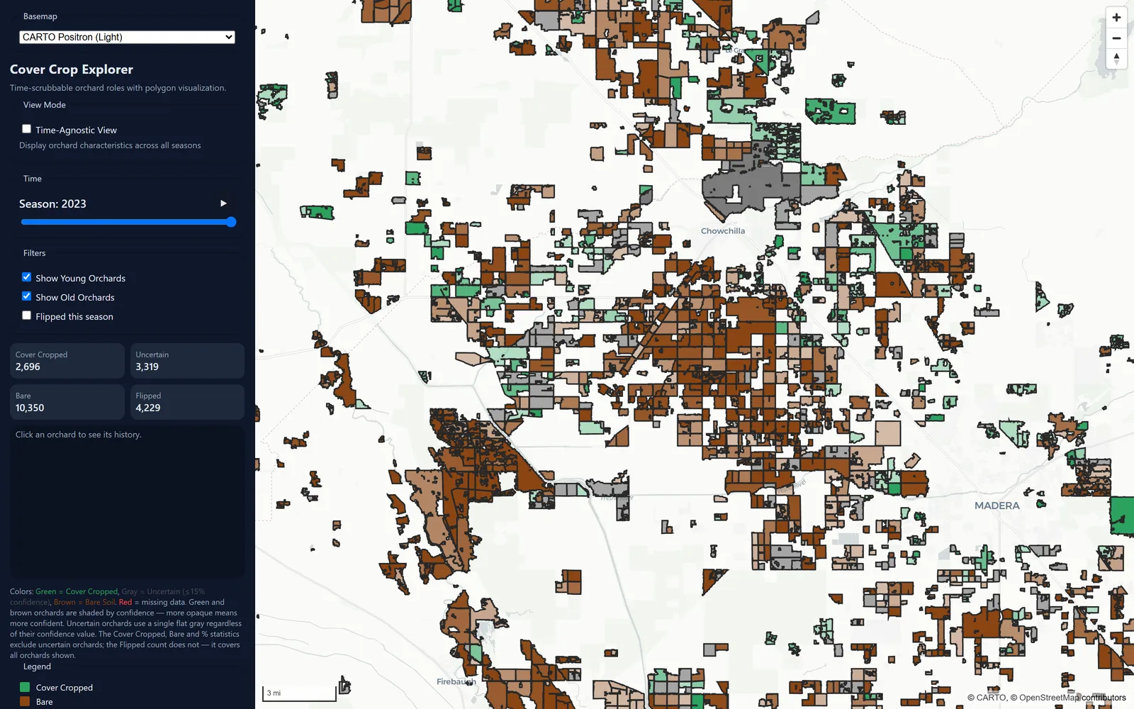
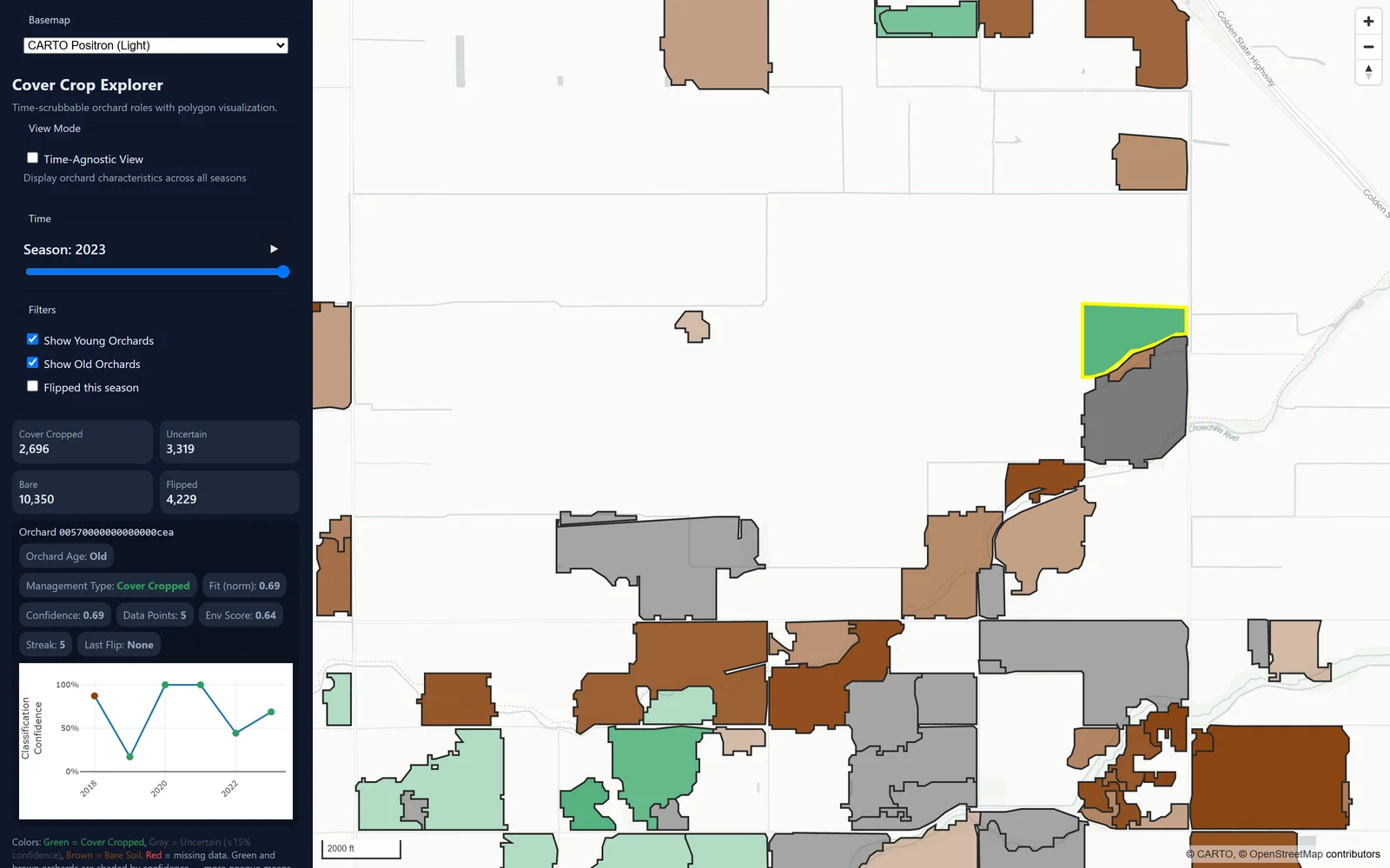
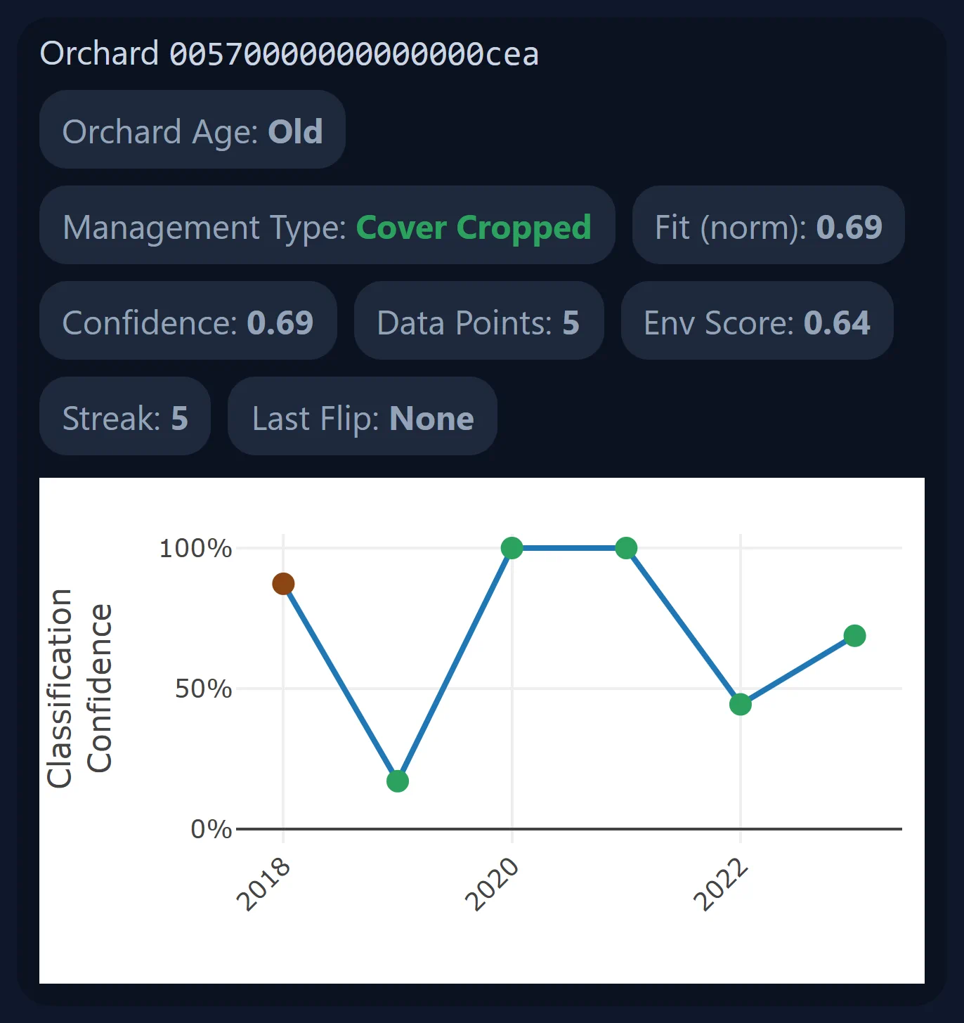
Scrubbing the slider is why this is a map and not a table: the same ground, six winters running, changing colour as orchards come in and out of cover.
The same view, six winters. Left to right: 2018–19, 2019–20, 2020–21, 2021–22, 2022–23, 2023–24.
Honest limits & status
Honest limits
- This is an experiment and a work in progress, not a finished product.
- Every estimate is an inference from satellite-observed inter-row greening, not a ground-truthed survey. Nothing here was checked in a field. Low-confidence calls are kept separate from firm ones and left out of the headline counts, but "confident" here means the signal was clean, not that anyone verified it.
- I'm not claiming adoption rates, acreage totals, or policy conclusions. The map estimates a signal. It doesn't measure a practice. And to say it once more, because it's the number people misread: 16,365 is how many orchards I classified, not how many planted cover crops.
The app's own interface has known problems. Its multi-winter streak filter offers a "7+ season" option that matches zero orchards, because the dataset only holds six winters and nothing can ever satisfy it. Some of the app's UI text overstates what the analysis supports. I'd rather say that here than have someone find it themselves. The interface is a claim, and the claim isn't always calibrated to the data behind it.
The obvious next step is ground truth. Without a set of orchards whose management is actually known, there's no way to put an accuracy number on any of this, and an accuracy number is what would turn the experiment into evidence.
Links
The map is the deliverable, and it's better used than described. Pick a winter, zoom into an orchard block, and click a polygon to see what the classifier thought and how sure it was.
- Live map The live experiment. Fully static, so there's nothing to spin up and nothing to sign in to.
- Repository Analysis and app source.
Explore the experiment in the live map.
Get in touch
I'm an early-career environmental data scientist in the SF Bay Area, working on remote sensing for water resources and agriculture. If any of this is close to what your team does, I'd like to hear about it.