Self-directed final project · Introduction to GIS · ArcGIS Pro
Traffic exposure and birth rates in Alameda County
The one assignment where I picked the question myself, so I picked the one I actually wanted answered.
What it was
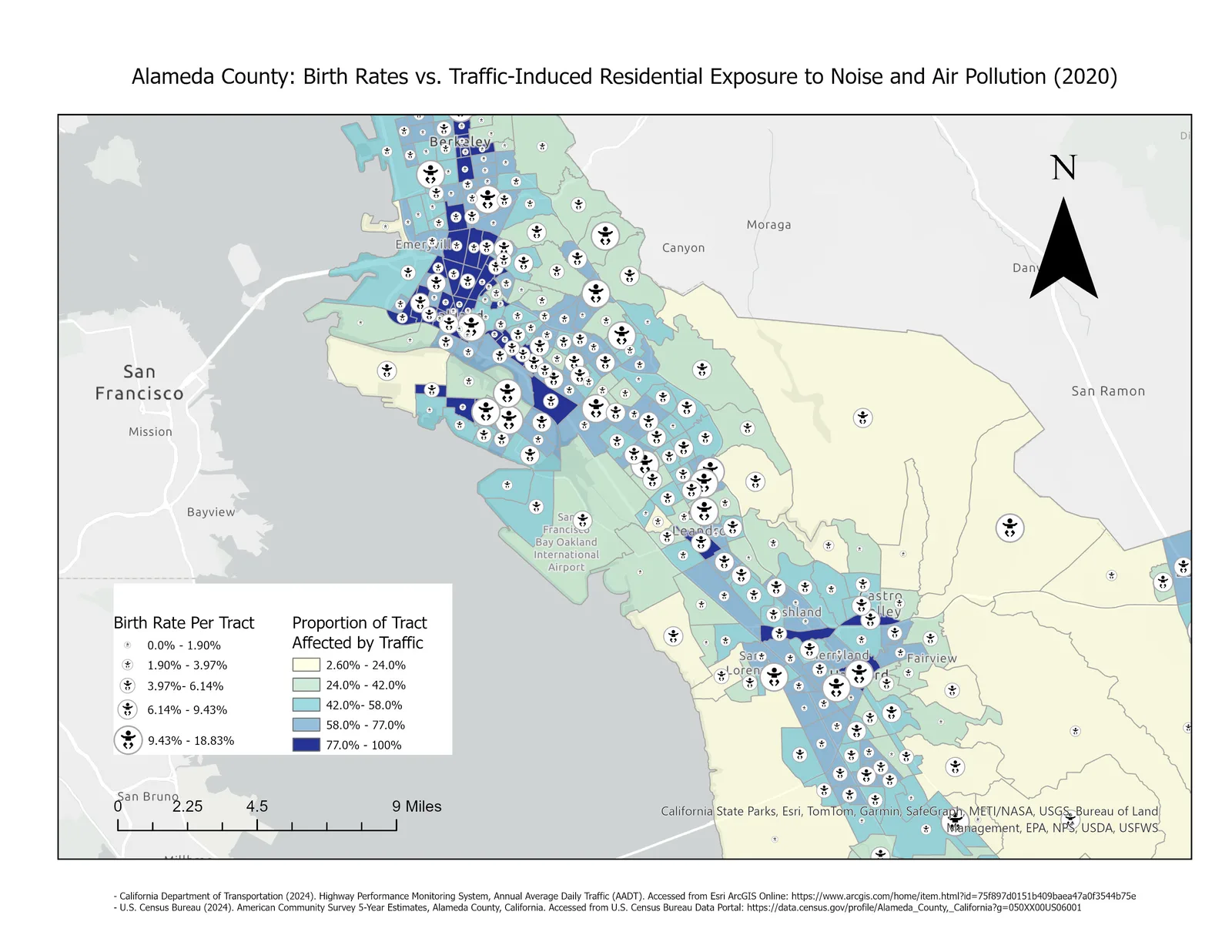
The final project in the intro GIS course was open. Rather than a set exercise, I could pick a county and a question, and the question I picked was where in Alameda County the people most likely to be affected by traffic pollution actually live. Traffic exposure is easy to map on its own. So is birth rate. The thing worth knowing is whether they land in the same places.
How it worked
Two datasets. Caltrans annual average daily traffic counts for the state highway network, and American Community Survey five-year tract data from the Census Bureau. In ArcGIS Pro I built the high-traffic zones off the Caltrans counts, intersected them with the census tracts, and calculated what share of each tract falls inside a zone. That share became the choropleth. The birth rate per tract became a proportional symbol drawn on top of it. Sources are cited in the map margin.
What I learned
Most of the decision here was in the display, not the analysis. Two variables in one frame instead of two maps side by side is a choice you make before you know whether it will work, and it only pays off if the reader can still separate the two once they are stacked.
Figure