Class assignment · ArcGIS Online Map Viewer · Published November 2025
Routing a transmission line by least cost
Two fixed endpoints, a valley in between, and a surface that says what every cell in it costs to cross.
What it was
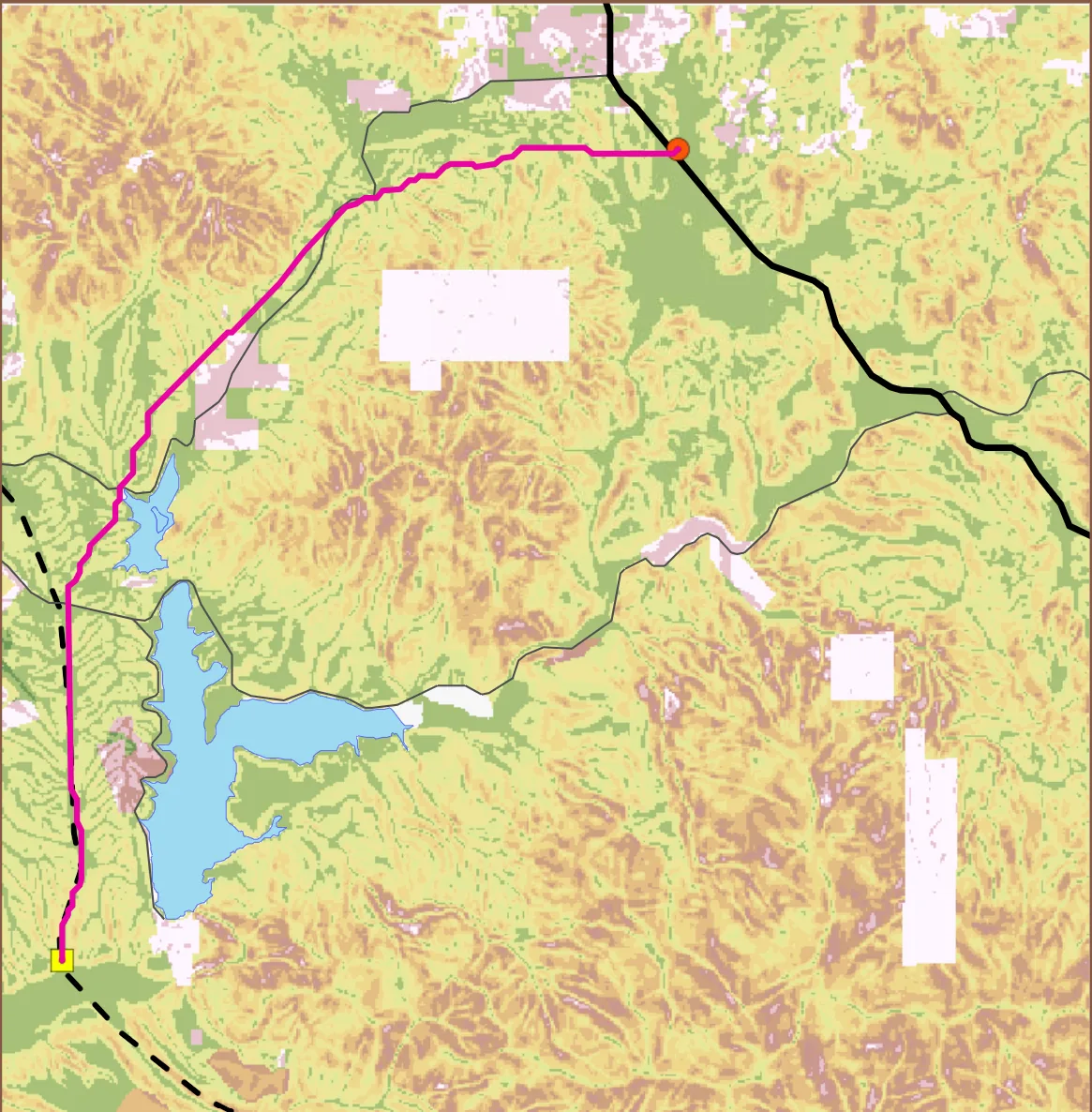
Get a transmission line from the Otay Valley Power Plant to the Jamul Substation, and pick the route by making the terrain argue for itself rather than by drawing a line that looks reasonable. The exercise runs on instructional data. The service that hosts it says so directly: this data is for instructional use only, modified and not identical to the source it came from. So the route is a real piece of analysis and it is not a real siting study for a real utility. Nothing here was proposed to anyone.
How it worked
Slope became cost. I reclassified the slope raster into ten equal-width bins running from 0 to about 30 degrees, and mapped each bin to an output cost of 1 through 10, so the flattest ground scores 1 and the steepest scores 10. That reclass table is published alongside the map, all ten rows of it, which means anyone can check the bin edges instead of taking my word for the surface. From there the cost surface drives the route. The proposed path came out as a polyline of 18,972.50 m, just under 19 km, with a 16.94 m connector at the start. The map carries the study area, the lakes, the existing power line and roads, and the two endpoints, all in California State Plane Zone 6.
What I learned
Publishing the reclass table with the map turned out to matter more than the route did. A least-cost path is only as good as the cost surface under it, and a cost surface is a set of decisions someone made about what counts as expensive. Leaving those ten rows visible is the difference between a route a reader can argue with and a line on a map.